In Part One of my data analysis of The Office, I looked at the writers and directors behind the series and how they correlated with episode ratings. In Part Two, I’m analyzing the transcript of the episodes to learn about character sentiment, word choice, line frequency, and dialogue partners.
Import and Clean Data
You may need to install.packages(“schrute”). The schrute package includes lines by character, the writers, and director for each episode.
NRC lexicon data source: https://saifmohammad.com/WebPages/NRC-Emotion-Lexicon.htm
Code Guide: https://www.tidytextmining.com/sentiment.html
library(dplyr)
library(schrute)
library(tidyr)
library(ggplot2)
library(tidytext)
library(textdata)
library(scales)
library(ggnetwork)

episode_text <- schrute::theoffice
This line converts all of the text to the tidy format, so that break down the text into one word per row, while keeping all of the metadata about the episode intact.
episode_text_parse <- episode_text %>%
  unnest_tokens(word, text)
Most Common Words and Most Number of Lines per Character
Excluding stop words, the most common words include greetings and the names of important characters (Michael, Dwight, Jim). Interesting that “call” and “stop” are on there, brings to mind either Michael or Dwight interrupting Jim’s sales calls. Because there are so many words, this chart only shows those that are said over 500 times.
episode_text_parse %>%
  filter(!word %in% stop_words$word) %>%
  count(word, sort = TRUE) %>%
  mutate(word = reorder(word, n)) %>%
  filter(n > 500) %>%
  ggplot(aes(word, n)) +
  geom_col(fill="steelblue") +
  labs(title="Most Common Words", y = "Frequency", x = "Word") +
  coord_flip() +
  theme(plot.title = element_text(size = 18, face = "bold", hjust = 0.5))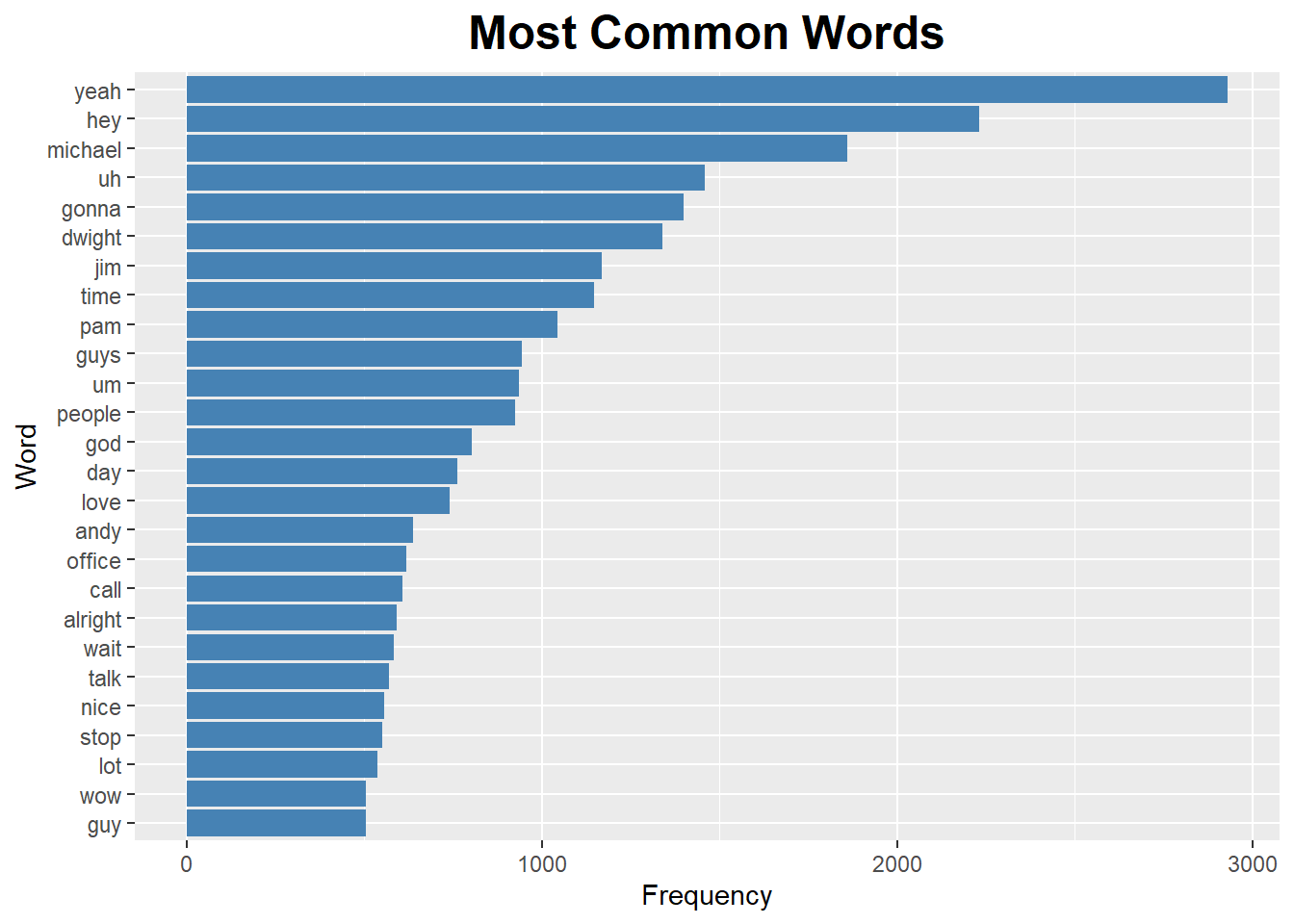
Michael has the most number of lines by far, despite not being in the last two seasons. It’s a little surprising to see Andy at the top, since he also wasn’t in all of the seasons. It’s worth noting that not all of the character names follow the same format. There are character names in quotes (“Angela”), lines the characters said together (Andy & Erin), and hilariously, Goldenface has his own lines. This chart only includes characters with at least 500 lines over the course of the series.
number_of_lines <-
  episode_text %>%
  group_by(character) %>%
  summarise(num_lines = n())

ggplot(number_of_lines %>% filter(num_lines > 500)) +
  geom_bar(aes(reorder(character, -num_lines), num_lines),
           alpha = 1, stat = "identity", fill = "steelblue") +
  labs(title="Characters with the Most Lines") +
  labs(x="Character", y="Number of Lines")  +
  theme_grey() +
  theme(axis.text.x = element_text(angle = 45, hjust = 1),
      plot.title = element_text(size = 18, face = "bold", hjust = 0.5))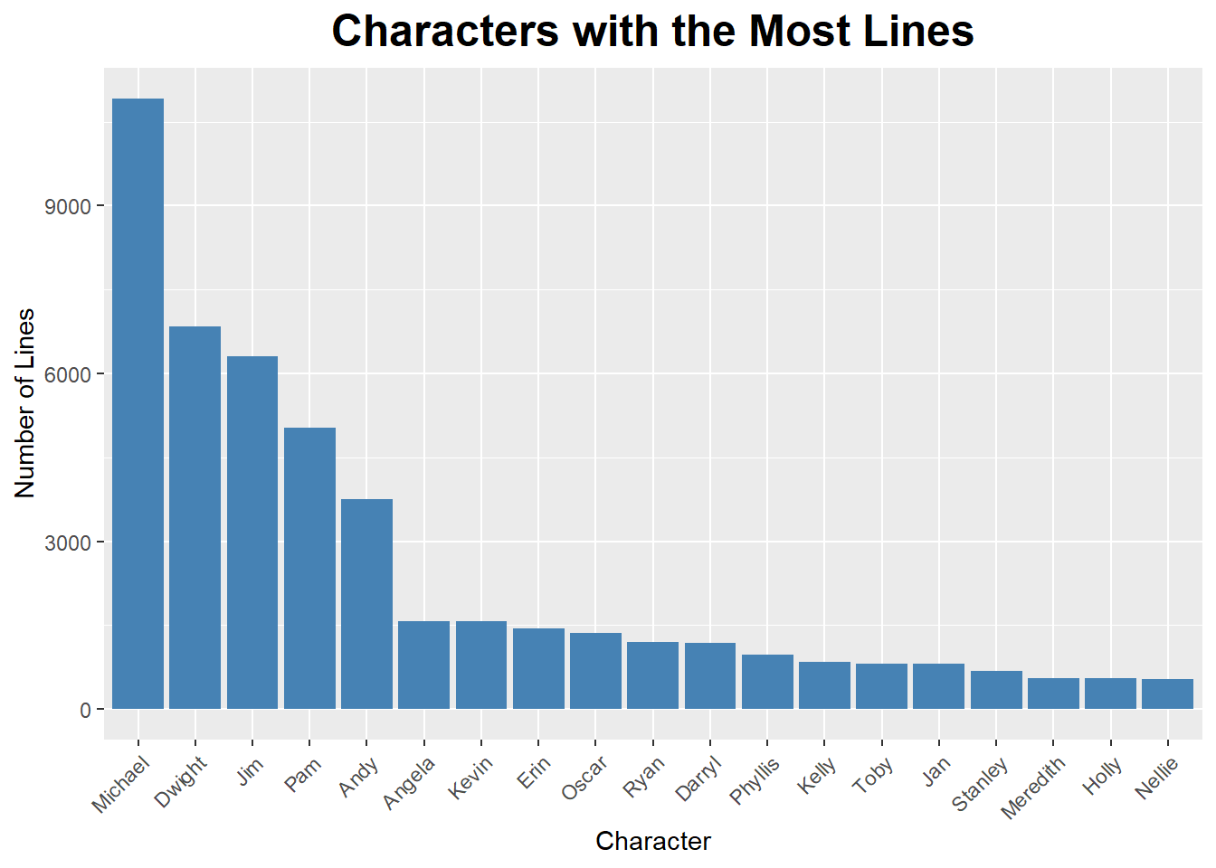
There are 9 seasons of the office. Steve Carell is in season 9, but only very briefly, he left the show in season 7. Ed Helms joined The Office in season 3, but played a bigger role in later seasons.
linesperseason <-
  episode_text %>%
    group_by(character, season) %>%
    summarise(num_lines = n())

ggplot(linesperseason %>% filter(character %in% c("Michael", "Andy")), aes(season, num_lines)) +
  geom_col(show.legend = FALSE, fill = "steelblue") +
  facet_wrap(~character, ncol = 2) +
  labs(title="Number of Lines per Season for Andy and Michael") +
  labs(x="Season", y="Number of Lines")  +
  theme_grey() +
  theme(plot.title = element_text(hjust = 0.5)) +
  scale_x_discrete("Season", limits = c(1:9))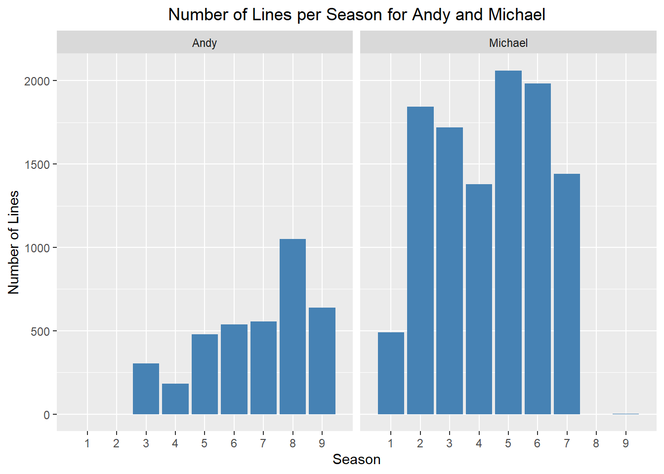
Sentiment Analysis of The Office
For part 1, we’ll look at individual words.
“good” and “god” are common joy words in The Office. Not sure about this is very accurate sentiment of this word, because all I can think of is Michael Scott shouting “Oh god! No god, please no!” when he sees Toby for the first time after like 6 months.
nrc_joy <- get_sentiments("nrc") %>%
  filter(sentiment == "joy")

joy_words_office <-
episode_text_parse %>%
  inner_join(nrc_joy) %>%
  count(word, sort = TRUE)

ggplot(joy_words_office %>% filter(n>55)) +
  geom_bar(aes(reorder(word, -n), n),
           alpha = 1, stat = "identity", fill = "steelblue") +
  labs(title="Most Common Joy Words") +
  labs(x="Word", y="Frequency")  +
  theme_grey() +
  theme(axis.text.x = element_text(angle = 45, hjust = 1),
      plot.title = element_text(size = 18, face = "bold", hjust = 0.5))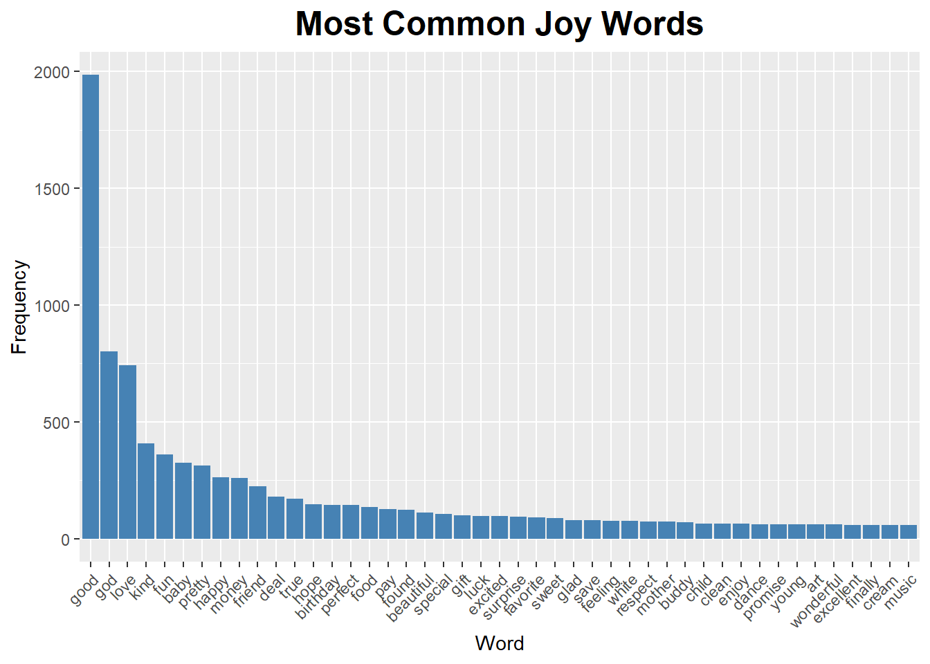
“idiot” is pretty high up in the list of ‘disgust’ sentiment words! Bonus wisdom from Dwight Scrute- “Whenever I’m about to do something, I think, ‘Would an idiot do that?’ And if they would, I do not do that thing.”
nrc_disgust <- get_sentiments("nrc") %>%
  filter(sentiment == "disgust")

episode_text_parse %>%
  inner_join(nrc_disgust) %>%
  count(word, sort = TRUE)
## # A tibble: 499 x 2
## word n
## <chr> <int>
## 1 bad 316
## 2 weird 205
## 3 hate 163
## 4 damn 137
## 5 hell 133
## 6 terrible 130
## 7 boy 111
## 8 lose 91
## 9 sick 91
## 10 idiot 88
## # … with 489 more rowsAcross all nine seasons, The Office has a really positive sentiment, and for most seasons there’s a peak towards the end for the season finale. It’s no wonder we can’t stop watching it.
the_office_sentiment <-
episode_text_parse %>%
  inner_join(get_sentiments("bing"), by = "word") %>%
  count(season, index = episode, sentiment) %>%
  spread(sentiment, n, fill = 0) %>%
  mutate(sentiment = positive - negative) %>%
  mutate(color = ifelse(sentiment < 0, "red","green4"))

ggplot(the_office_sentiment, aes(index, sentiment, fill = color)) +
  geom_col(show.legend = FALSE) +
  facet_wrap(~season, ncol = 3, scales = "free_x") +
  labs(title="Sentiment over The Office Seasons") +
  labs(x="Season", y="Sentiment")  +
  theme_grey() +
  theme(plot.title = element_text(hjust = 0.5)) +
  scale_fill_identity(guide = FALSE)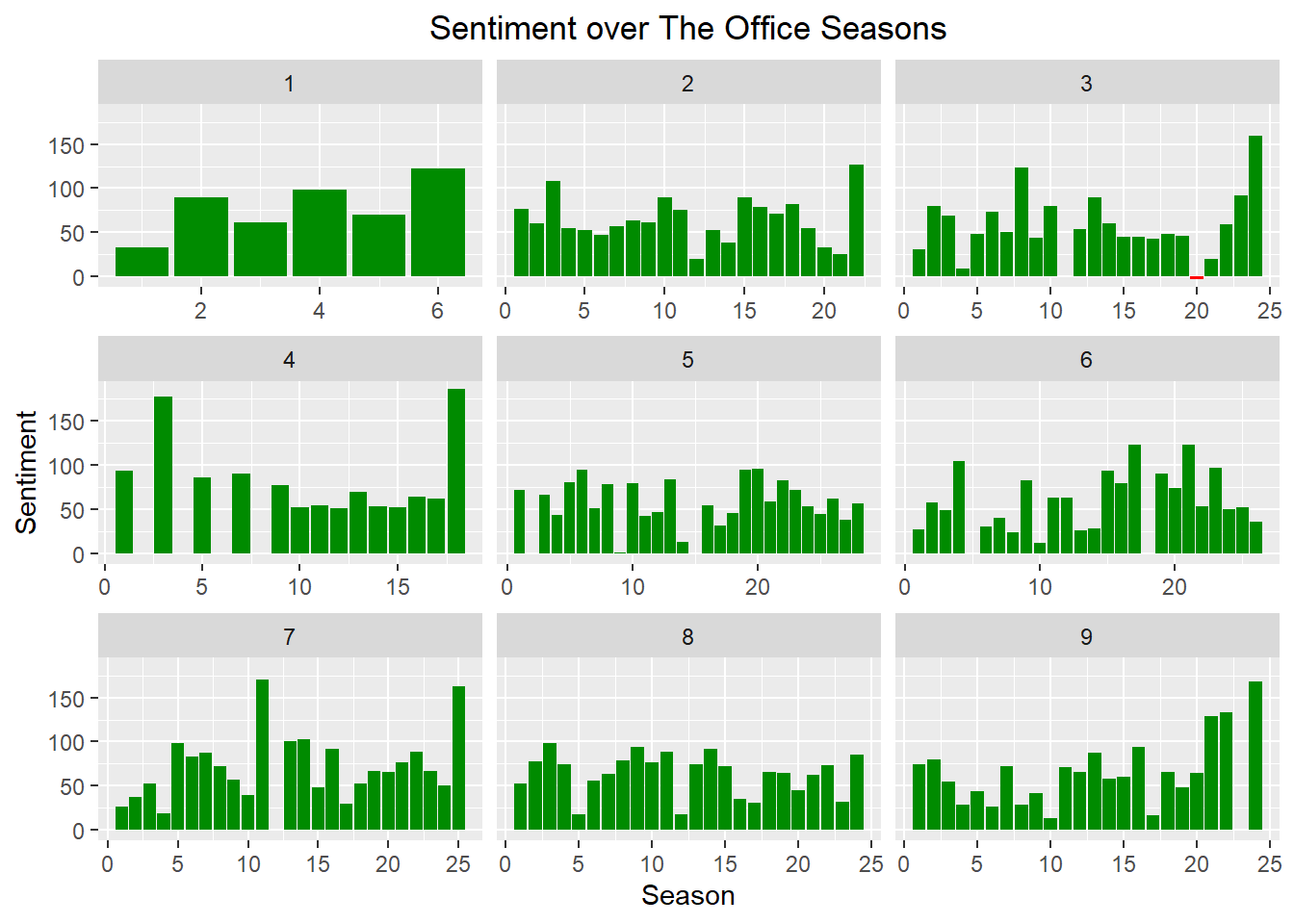
This confirms what we could see in the chart above, there’s very little negative sentiment.
summary(the_office_sentiment$sentiment)## Min. 1st Qu. Median Mean 3rd Qu. Max.
## -3.00 45.25 62.50 65.73 82.00 186.00Season 3 episode 20 is the only episode with negative sentiment.
the_office_sentiment %>%
  filter(sentiment < 0)
## # A tibble: 1 x 6
## season index negative positive sentiment color
## <int> <int> <dbl> <dbl> <dbl> <chr>
## 1 3 20 127 124 -3 redThat’s the Safety Training episode! So this makes sense, it probably has something to do with Michael Scott standing on the building shouting about the stress of his modern office.
episode_text_parse %>%
  filter(season == 3, episode == 20) %>%
  inner_join(get_sentiments("bing")) %>%
  select(episode_name, word, sentiment)
## # A tibble: 251 x 3
## episode_name word sentiment
## <chr> <chr> <chr>
## 1 Safety Training good positive
## 2 Safety Training like positive
## 3 Safety Training welcome positive
## 4 Safety Training like positive
## 5 Safety Training wins positive
## 6 Safety Training rich positive
## 7 Safety Training sorry negative
## 8 Safety Training strange negative
## 9 Safety Training anger negative
## 10 Safety Training wrong negative
## # … with 241 more rowsPositive sentiment words that occur most frequently are “like” and “right”, the chart is limited to display only words that occur more that 500 times.
sentiment_word_count <-
  episode_text_parse %>%
  inner_join(get_sentiments("bing"), by = "word") %>%
  count(word, sentiment, sort = TRUE) %>%
  ungroup()


ggplot(sentiment_word_count %>% filter(sentiment == "positive", n > 500)) +
  geom_bar(aes(reorder(word, -n), n),
           alpha = 1, stat = "identity", fill = "steelblue") +
  labs(title="Most Common Positive Words") +
  labs(x="Word", y="Frequency")  +
  theme_grey() +
  theme(axis.text.x = element_text(angle = 45, hjust = 1),
      plot.title = element_text(size = 18, face = "bold", hjust = 0.5))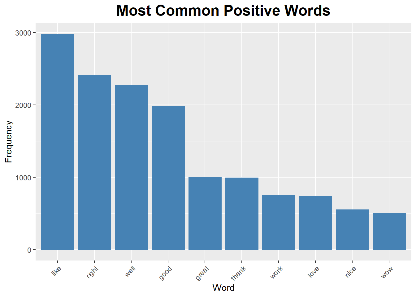
The most frequent negative sentiment words are “sorry” and “bad”. The volume of these words is much lower than the positive sentiment ones. It’s also a little strange that “funny” is considered a negative word.
ggplot(sentiment_word_count %>% filter(sentiment == "negative", n > 150)) +
  geom_bar(aes(reorder(word, -n), n),
           alpha = 1, stat = "identity", fill = "steelblue") +
  labs(title="Most Common Negative Words") +
  labs(x="Word", y="Frequency")  +
  theme_grey() +
  theme(axis.text.x = element_text(angle = 45, hjust = 1),
      plot.title = element_text(size = 18, face = "bold", hjust = 0.5))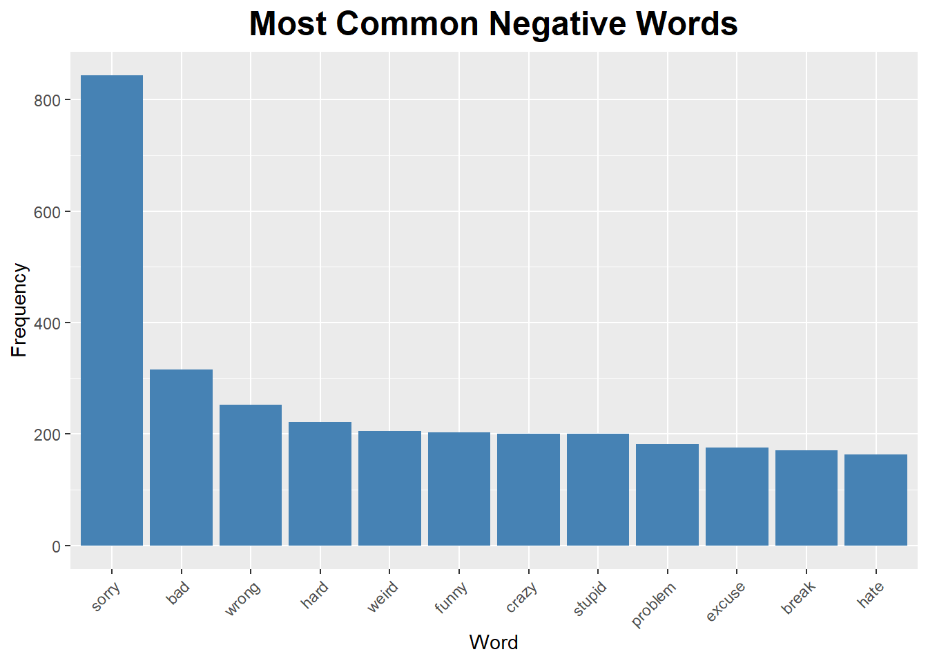
Michael Scott has a mostly positive sentiment, but there are a few episodes where he has an overall negative sentiment.
the_office_sentiment_Michael <-
episode_text_parse %>%
  filter(character == "Michael") %>%
  inner_join(get_sentiments("bing"), by = "word") %>%
  count(season, index = episode, sentiment) %>%
  spread(sentiment, n, fill = 0) %>%
  mutate(sentiment = positive - negative) %>%
  mutate(color = ifelse(sentiment < 0, "red","green4"))

ggplot(the_office_sentiment_Michael, aes(index, sentiment, fill = color)) +
  geom_col(show.legend = FALSE) +
  facet_wrap(~season, ncol = 3, scales = "free_x") +
  labs(title="Michael Scott Sentiment over The Office Seasons") +
  labs(x="Season", y="Sentiment")  +
  theme_grey() +
  theme(plot.title = element_text(hjust = 0.5)) +
  scale_fill_identity(guide = FALSE)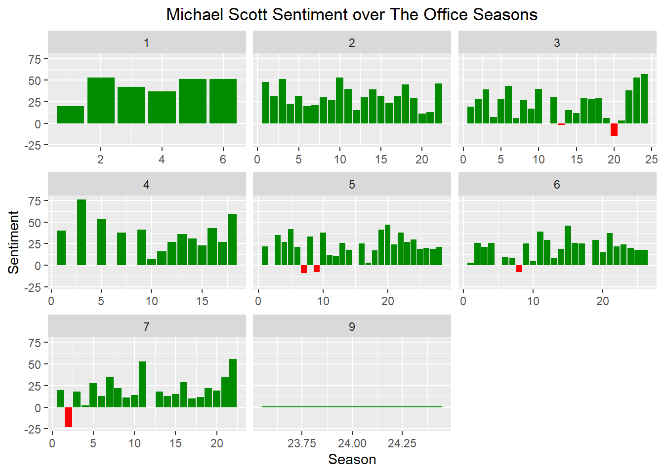
Michael Scott has negative sentiment in Traveling Salesman, Safety Training, Customer Survey, Frame Toby, Koi Pond, and Counseling. These all involve either bad things happening to Michael (falling into a koi pond) or Michael doing bad things (framing Toby). My only remaining question on this is WHERE is the episode where Michael grills his foot?!
the_office_sentiment_Michael %>%
  filter(sentiment < 0)
## # A tibble: 6 x 6
## season index negative positive sentiment color
## <int> <int> <dbl> <dbl> <dbl> <chr>
## 1 3 13 20 18 -2 red
## 2 3 20 59 44 -15 red
## 3 5 7 23 14 -9 red
## 4 5 9 38 30 -8 red
## 5 6 8 42 34 -8 red
## 6 7 2 37 14 -23 redepisode_text %>%
filter((season == 3 & episode %in% c(13,20))
|(season == 5 & episode %in% c(7,9))
| (season == 6 & episode == 8)
| (season == 7 & episode == 2)
) %>%
distinct(episode_name, season, episode)## # A tibble: 6 x 3
## episode_name season episode
## <chr> <int> <int>
## 1 Traveling Salesmen 3 13
## 2 Safety Training 3 20
## 3 Customer Survey 5 7
## 4 Frame Toby 5 9
## 5 Koi Pond 6 8
## 6 Counseling 7 2Dwight is way more sinister! The Angela cheating on Dwight plot line is part of seasons 5 and 6, so the drop in season 6 makes sense. His positive sentiment gets a bump in seasons 8 and 9 after Michael leaves. He and Jim become friends and he gets back together with Angela in those seasons.
the_office_sentiment_Dwight <-
episode_text_parse %>%
  filter(character == "Dwight") %>%
  inner_join(get_sentiments("bing"), by = "word") %>%
  count(season, index = episode, sentiment) %>%
  spread(sentiment, n, fill = 0) %>%
  mutate(sentiment = positive - negative) %>%
  mutate(color = ifelse(sentiment < 0, "red","green4"))

ggplot(the_office_sentiment_Dwight, aes(index, sentiment, fill = color)) +
  geom_col(show.legend = FALSE) +
  facet_wrap(~season, ncol = 3, scales = "free_x") +
  labs(title="Dwight Schrute Sentiment over The Office Seasons") +
  labs(x="Season", y="Sentiment")  +
  theme_grey() +
  theme(plot.title = element_text(hjust = 0.5)) +
    scale_fill_identity(guide = FALSE)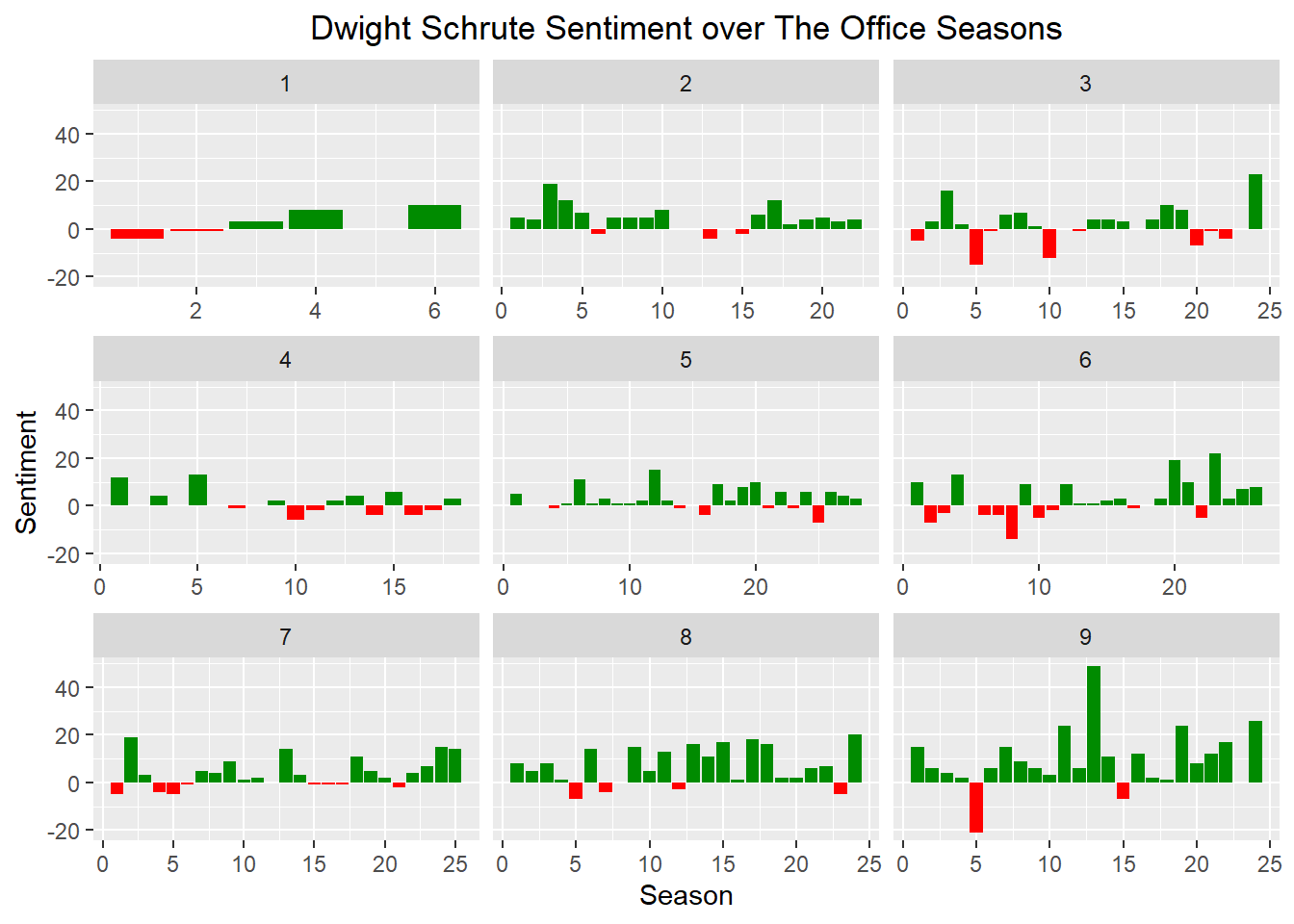
Text Analysis: Groups of Words
Now we’ll look at groups of words together. I’m grouping words by 5.
The missing word_group is from there being less than five words in a single line. It’s funny that the list of the most common five words includes “my god oh my god” and “oh my god oh my”. Unsurprisingly, we also see “dunder mifflin this is pam”.
episode_text_groups <-
  episode_text %>%
  unnest_tokens(word_group, text, token = "ngrams", n=5)

word_group_count <-
  episode_text_groups %>%
  group_by(word_group) %>%
  summarise(freq = n()) %>%
  filter(!is.na(word_group))

ggplot(word_group_count %>% filter(freq>15)) +
  geom_bar(aes(reorder(word_group, -freq), freq),
           alpha = 1, stat = "identity", fill = "steelblue") +
  labs(title="Most Common Groups of Words") +
  labs(x="Word Group", y="Frequency")  +
  theme_grey() +
  theme(axis.text.x = element_text(angle = 45, hjust = 1),
      plot.title = element_text(size = 18, face = "bold", hjust = 0.5))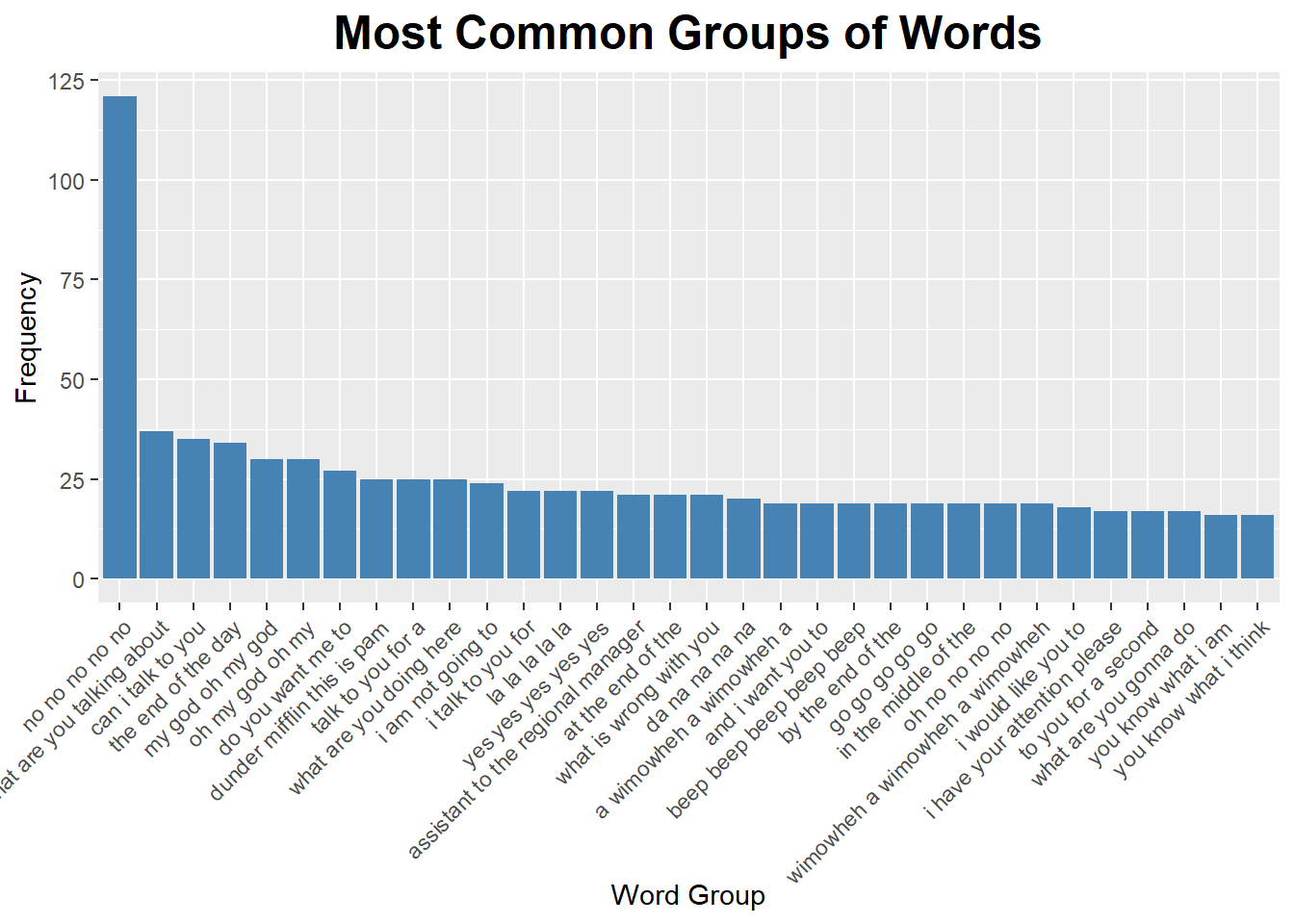
Now we will look at word groupings without stop words.
episode_text_sep <-
  episode_text_groups %>%
  separate(word_group, c("word_1", "word_2", "word_3", "word_4", "word_5"), sep = " ")

episode_text_sep_filter <-
  episode_text_sep %>%
  filter(!word_1 %in% stop_words$word,
         !word_2 %in% stop_words$word,
         !word_3 %in% stop_words$word,
         !word_4 %in% stop_words$word,
         !word_5 %in% stop_words$word)

episode_text_sep_filter %>%
  count(word_1, word_2, word_3, word_4, word_5, sort = TRUE)
## # A tibble: 1,617 x 6
## word_1 word_2 word_3 word_4 word_5 n
## <chr> <chr> <chr> <chr> <chr> <int>
## 1 <NA> <NA> <NA> <NA> <NA> 20529
## 2 la la la la la 22
## 3 da na na na na 20
## 4 beep beep beep beep beep 19
## 5 blah blah blah blah blah 10
## 6 bum bum bum bum bum 8
## 7 ha ha ha ha ha 8
## 8 na na na na na 8
## 9 whoa whoa whoa whoa whoa 8
## 10 nope nope nope nope nope 7
## # … with 1,607 more rowsThe “la” word coming up is from singing in a few of the Christmas episodes. The Duel episode is coming up because Dwight imitates Andy as Andy pushes Dwight into a hedge with his car.
episode_text_sep_filter %>%
  filter(word_1 == "la", word_2 == "la") %>%
  distinct(episode_name)
## # A tibble: 5 x 1
## episode_name
## <chr>
## 1 E-Mail Surveilance
## 2 A Benihana Christmas (Parts 1&2)
## 3 Moroccan Christmas
## 4 The Duel
## 5 Heavy CompetitionCharacter Pairs Text Analysis
Now let’s look at words used across character pairs. Michael talks a lot more about Holly and Jan, and Jim talks a lot more about Cece. Michael also says “business” and “corporate” more often. They both mention Pam and Dwight a decent bit, too.
charac_word_freq <-
episode_text_parse %>%
  filter(!word %in% stop_words$word) %>%
  group_by(character) %>%
  count(word, sort = TRUE) %>%
  left_join(episode_text_parse %>%
              group_by(character) %>%
              summarise(total = n()), by = "character") %>%
  mutate(freq = n/total)

charac_word_freq_JM <-
  charac_word_freq %>%
  select(character, word, freq) %>%
  spread(character, freq) %>%
  arrange(Jim, Michael)

ggplot(charac_word_freq_JM, aes(Jim, Michael)) +
  geom_jitter(alpha = 0.1, size = 2.5, width = 0.25, height = 0.25) +
  geom_text(aes(label = word), check_overlap = TRUE, vjust = 1.5) +
  scale_x_log10(labels = percent_format()) +
  scale_y_log10(labels = percent_format()) +
  geom_abline(color = "red") +
  labs(title="Word Usage Rate Between Character Pairs") +
  theme(plot.title = element_text(size = 18, face = "bold", hjust = 0.5))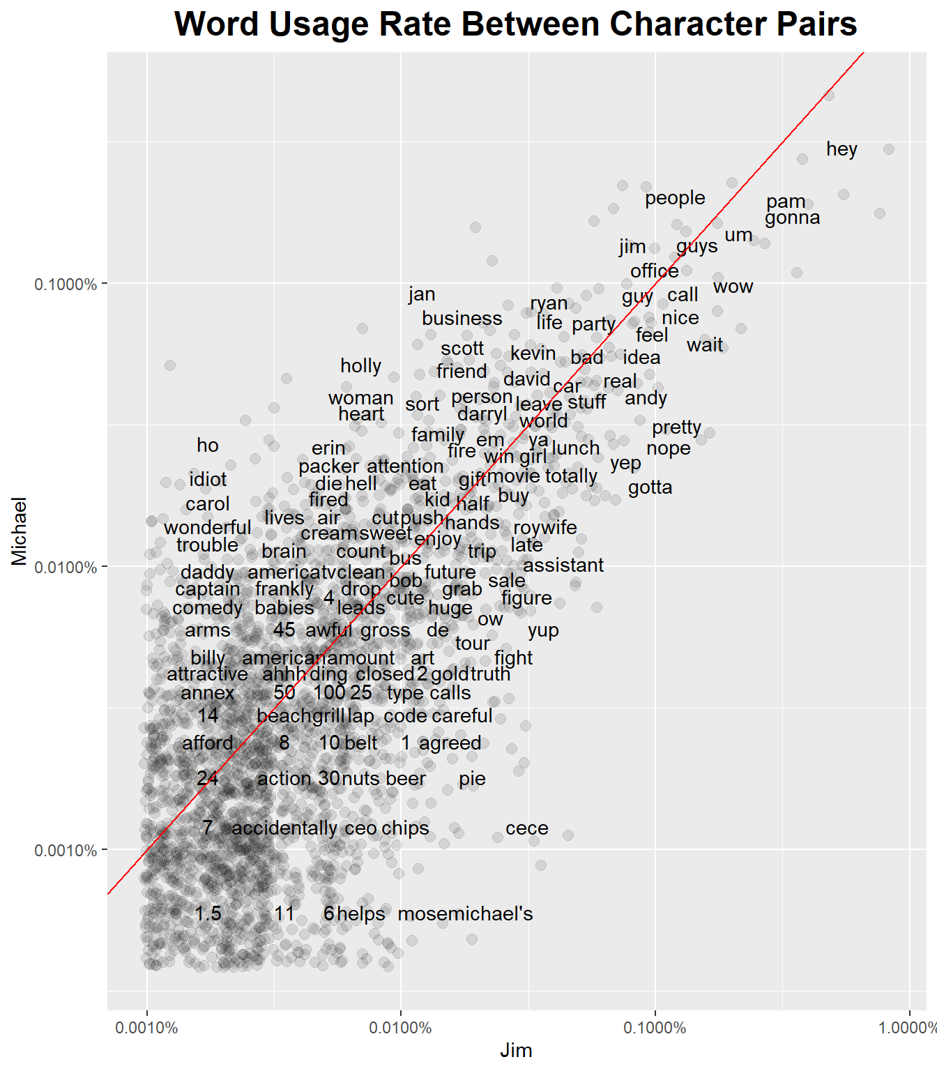
Angela, unsurpisigly, uses the word “cat” or “cats” frequently. Also “Dwight”, “Kevin” and “senator”. You can also see “party” and “committee” showing up for her. Dwight has a few words that stick out, like “Jim”, “Schrute”, “paper” and “Ryan”.
charac_word_freq_DA <-
  charac_word_freq %>%
  select(character, word, freq) %>%
  spread(character, freq) %>%
  arrange(Dwight, Angela)

ggplot(charac_word_freq_DA, aes(Dwight, Angela)) +
  geom_jitter(alpha = 0.1, size = 2.5, width = 0.25, height = 0.25) +
  geom_text(aes(label = word), check_overlap = TRUE, vjust = 1.5) +
  scale_x_log10(labels = percent_format()) +
  scale_y_log10(labels = percent_format()) +
  geom_abline(color = "red") +
  labs(title="Word Usage Rate Between Character Pairs") +
  theme(plot.title = element_text(size = 18, face = "bold", hjust = 0.5))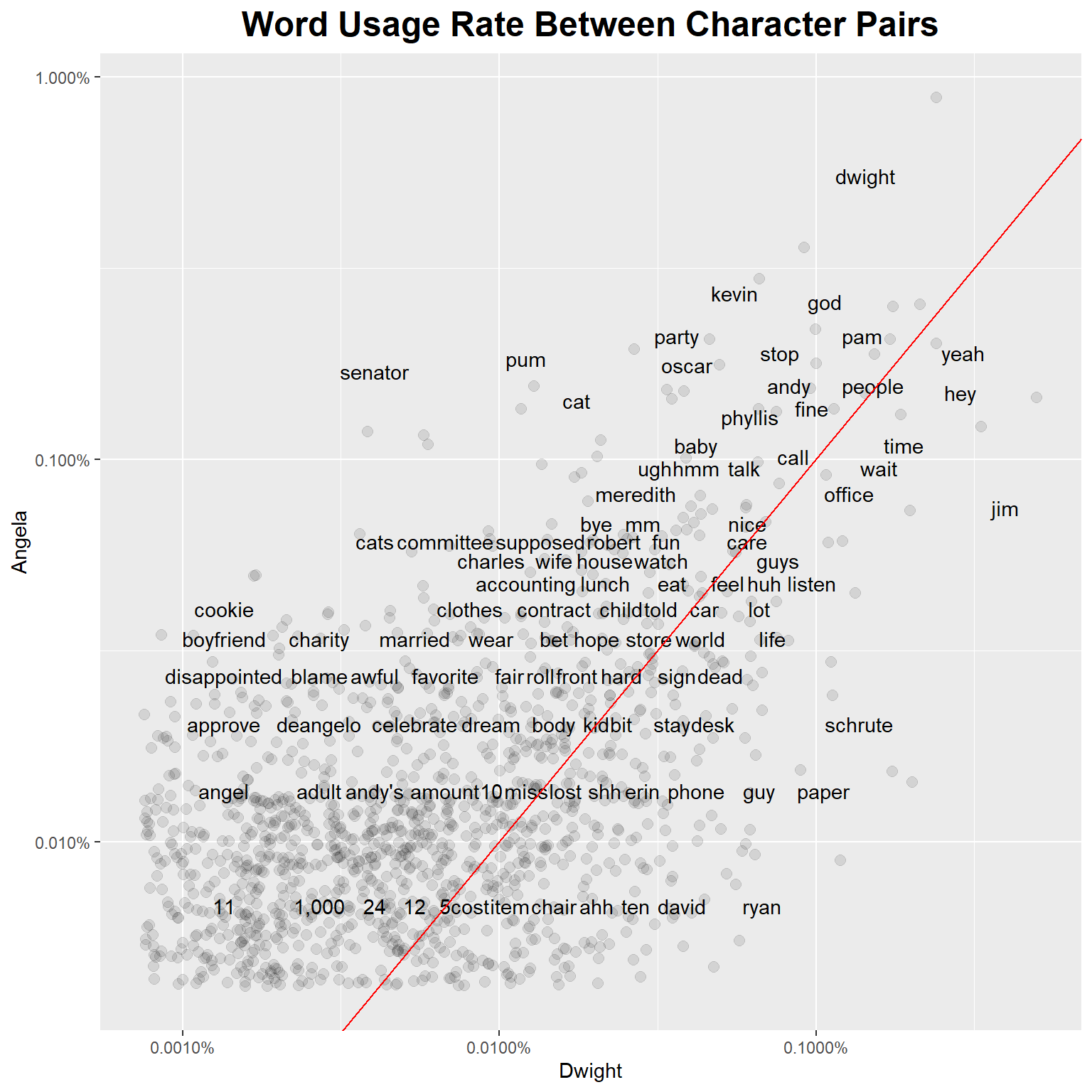
Looking and Kevin and Oscar, Kevin says “yeah”, “cool”, “eat”, and “hot” relatively frequently. Oscar has “gay”, “dollars”, and “sense”. They both talk about Michael a similar amount (which is a lot). Pretty on brand for both of them.
charac_word_freq_OK <-
  charac_word_freq %>%
  select(character, word, freq) %>%
  spread(character, freq) %>%
  arrange(Oscar, Kevin)

ggplot(charac_word_freq_OK, aes(Oscar, Kevin)) +
  geom_jitter(alpha = 0.1, size = 2.5, width = 0.25, height = 0.25) +
  geom_text(aes(label = word), check_overlap = TRUE, vjust = 1.5) +
  scale_x_log10(labels = percent_format()) +
  scale_y_log10(labels = percent_format()) +
  geom_abline(color = "red") +
  labs(title="Word Usage Rate Between Character Pairs") +
  theme(plot.title = element_text(size = 18, face = "bold", hjust = 0.5))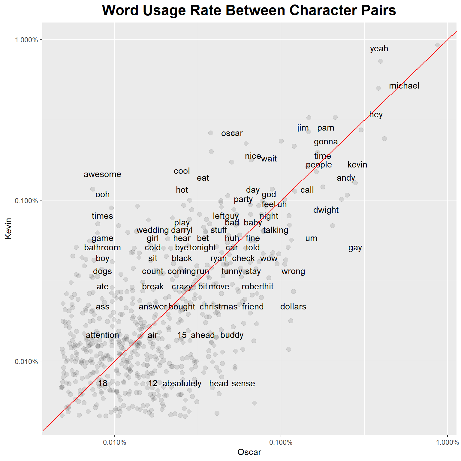
Line Adjacencies, Who is Talking to Who Most Frequently?
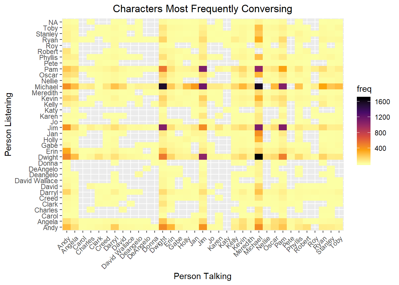
The primary characters tend to dominate most conversations but we can pick up on the smaller friendship pairs too, like Oscar and Kevin.
episode_text_dialogue <-
episode_text %>%
  group_by(season, episode) %>%
  mutate(talkingto = lead(character)) %>%
  group_by(character, talkingto) %>%
  summarise(freq = n())

keep_chars <- episode_text_dialogue %>%
  gather(tofrom, person, character:talkingto) %>%
  group_by(person) %>%
  summarize(totfreq = sum(freq)) %>%
  filter(totfreq > 150) %>%
  pull(person)

ggplot(episode_text_dialogue %>% filter(character %in% keep_chars, talkingto %in% keep_chars), aes(x=character, y=talkingto)) +
  geom_tile(aes(fill = freq)) +
  scale_fill_viridis_c(option = "B", direction = -1) +
  labs(title = "Characters Most Frequently Conversing",
       y = "Person Listening",
       x = "Person Talking") +
    theme(axis.text.x = element_text(angle = 45, hjust = 1),
          plot.title = element_text(hjust = 0.5))